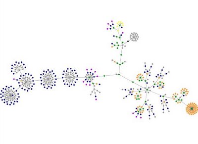
 This is what my blog looks like as a graph. I won't pretend to have any idea what it all means but it was pretty cool watching it create itself. I bet Chris Zinkula knows what it means. Click here to get one of your own or try out some other sites. So far the coolest I've seen is for BoingBoing.net. Try it out!
Yes. And AMEN, and all that.
14 years ago
What do the colors mean?
ReplyDeleteblue: for links (the A tag)
red: for tables (TABLE, TR and TD tags)
green: for the DIV tag
violet: for images (the IMG tag)
yellow: for forms (FORM, INPUT, TEXTAREA, SELECT and OPTION tags)
orange: for linebreaks and blockquotes (BR, P, and BLOCKQUOTE tags)
black: the HTML tag, the root node
gray: all other tags
well yeah i saw that but what the heck is a DIV tag?!
ReplyDeletehttp://www.w3schools.com/tags/tag_div.asp
ReplyDelete:)
see, i knew you'd know
ReplyDeleteknow it all
GO TO BED! You have to get up early in the morning! You have that THING remember?! I mean SERIOUSLY! Be responsible. GAWSH!
ReplyDeletewhatever dude, you're the old man.
ReplyDeletei don't have anything to do until 2:30. except maybe i'll get up early to be the first person to vote. maybe i'll go right now and camp out in front of my polling place dressed up as my favorite midterm electoral hero.
ps- my word verification was "ermaglud"
"Word Verification"? How primitive. The correct word is "captcha".
ReplyDeleteMy captcha is "bwevwa".
See how much cooler I look when I use that word? :P
Oh! It's pretty!
ReplyDeleteI want it as stationary!